

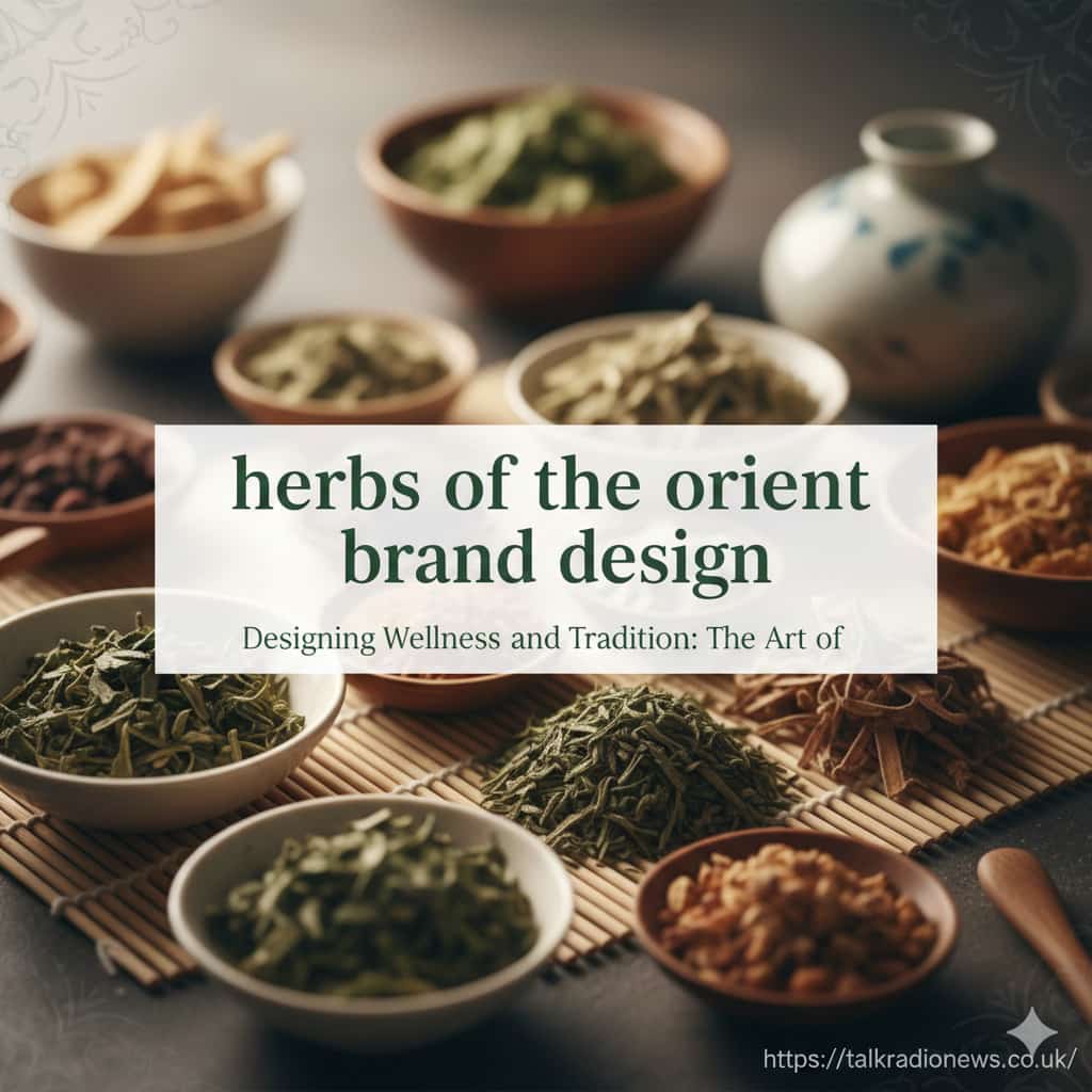
Have you ever picked up a product and felt an instant connection? The colors, fonts, and imagery all work together to tell a story. This is the magic of great brand design. When we explore the world of traditional wellness, the herbs of the orient brand design becomes a fascinating study in balancing ancient wisdom with modern appeal. It’s about more than just a pretty package; it’s about conveying trust, authenticity, and the very essence of nature’s healing power. This type of design needs to communicate centuries of tradition while still looking fresh and relevant on a crowded shelf. Crafting this identity is a delicate art, blending cultural respect with contemporary marketing savvy to create something truly special.
- Key Takeaways
- Understanding the Essence of “Herbs of the Orient”
- The Role of Color in Conveying Tradition and Nature
- Typography: Blending Ancient Scripts with Modern Fonts
- The Power of Symbolism and Imagery
- Packaging Materials: Reflecting Natural and Premium Values
- Crafting a Compelling Brand Story
- Digital Presence: An Extension of the Brand
- Navigating Regulatory and Labeling Requirements
- Modern vs. Traditional Design Approaches
- Conclusion
Key Takeaways
- Cultural Authenticity is Key: Effective brand design for oriental herbs must be rooted in the cultural history and symbolism of the ingredients.
- Color Psychology Matters: Colors like green, red, gold, and earthy browns evoke feelings of nature, vitality, and premium quality.
- Modern Meets Traditional: The most successful brands blend traditional patterns and calligraphy with clean, modern typography and minimalist layouts.
- Storytelling Sells: Consumers connect with brands that share a compelling story about their origins, ingredient sourcing, and philosophy.
- Transparency Builds Trust: Clear labeling, ingredient information, and certifications are crucial for building consumer confidence in wellness products.
Understanding the Essence of “Herbs of the Orient”
Before a single design element is chosen, it’s crucial to understand what “Herbs of the Orient” represents. This isn’t just about plants; it’s about a holistic philosophy of wellness that has been refined over thousands of years. It encompasses traditions from China, Japan, Korea, and other parts of Asia, where nature and the body are seen as interconnected systems. Principles like balance (yin and yang) and energy flow (qi) are central to these traditions.
Therefore, brand design must go beyond surface-level aesthetics. It needs to reflect these deep-rooted concepts. The design should feel respectful, not appropriative. It should communicate efficacy without making unsubstantiated medical claims. This involves deep research into the symbolism of specific herbs, the cultural meaning of colors, and the historical context of the wellness practices being represented. A brand that successfully captures this essence feels genuine and trustworthy, inviting consumers to explore a time-honored path to well-being. This foundational understanding is the most critical step in creating an effective herbs of the orient brand design.
The Role of Color in Conveying Tradition and Nature
Color is a powerful, non-verbal communicator, and in the context of oriental herbs, it does a lot of heavy lifting. The color palette is often the first thing a consumer notices, setting the tone for the entire brand experience. Earthy tones are a common and effective choice, as they create an immediate link to nature.
H3: Common Color Palettes and Their Meanings
- Deep Greens: Symbolizing nature, vitality, growth, and healing, green is a foundational color. It can range from a bright, fresh jade to a deep, forest green, each conveying a slightly different nuance of natural energy.
- Earthy Browns and Beiges: These colors represent the soil, roots, and bark from which many herbs are derived. They evoke a sense of being grounded, stable, and wholesome.
- Rich Reds and Golds: In many Asian cultures, red signifies luck, vitality, and energy, while gold represents prosperity, quality, and imperial prestige. Used as accent colors, they can elevate a brand, suggesting a premium, powerful product.
- Calming Blues and Whites: While less common as a primary color, blues and whites can be used to suggest purity, calmness, and clarity. This is especially effective for products aimed at relaxation or mental focus.
The choice of color directly impacts how a consumer perceives the product’s quality and purpose. A brand for an energizing ginseng tea might use pops of red, while a product for sleep might lean on calming blues and deep, earthy browns.
Typography: Blending Ancient Scripts with Modern Fonts
Typography is another critical element in herbs of the orient brand design. The fonts you choose must be legible while also contributing to the brand’s story. Many successful brands find a harmonious balance between traditional calligraphic styles and clean, modern sans-serif fonts.
The traditional script, whether it’s Chinese characters or an elegant brush script, connects the brand to its cultural heritage. It acts as a visual cue for authenticity and tradition. However, using it for all text can make a package difficult to read, especially for a Western audience. This is where modern fonts come in.
A clean, minimalist sans-serif font used for the product name, descriptions, and ingredient lists provides clarity and a contemporary feel. It makes the product feel accessible and trustworthy. This combination suggests that the brand respects its roots but is also professional and relevant in today’s market. The contrast between the ornate, historical script and the simple, modern font creates a dynamic and visually appealing design that is both beautiful and functional.
The Power of Symbolism and Imagery
Imagery and symbols are the heart of visual storytelling in this niche. They can convey complex ideas instantly. Think of the Yin-Yang symbol, which perfectly represents the core principle of balance in Traditional Chinese Medicine. Other powerful symbols include the lotus flower (purity and enlightenment), bamboo (strength and flexibility), and cranes (longevity and good fortune).
Incorporating these symbols thoughtfully can add layers of meaning to the brand identity. However, it’s important to use them with respect and understanding. Simply placing a dragon on a package because it “looks Asian” is a shallow approach. A better method is to choose symbols that relate directly to the product’s function or the brand’s philosophy.
Botanical illustrations are another powerful tool. Detailed, elegant drawings of the herbs themselves—like ginseng root, goji berries, or reishi mushrooms—can be both beautiful and educational. They highlight the natural origins of the product and showcase the beauty of the ingredients. This approach emphasizes transparency and a connection to the natural world.
Packaging Materials: Reflecting Natural and Premium Values
The physical feel of the packaging is just as important as its visual design. The materials chosen should align with the brand’s values. For a brand focused on nature and wellness, sustainable and natural materials are an obvious choice.
Recycled paper, unbleached cardboard, glass jars, and wooden lids all reinforce a message of environmental responsibility and purity. These materials have a tactile quality that feels more premium and thoughtful than simple plastic. A consumer holding a heavy glass jar of herbs feels the quality in their hands before they even open it.
The structure of the packaging also matters. A beautifully constructed box, a carefully tied ribbon, or a wax seal can transform a simple product into a luxurious experience. This attention to detail communicates that the brand cares about every aspect of its product, from sourcing the ingredients to the final presentation. It elevates the brand from a simple commodity to a coveted wellness ritual.
Crafting a Compelling Brand Story
Beyond visuals, the most memorable brands have a compelling story. What is the origin of the company? Were the recipes passed down through generations? How are the herbs sourced? This narrative provides the emotional hook that turns a one-time buyer into a loyal customer.
Your brand story should be woven throughout your marketing, from the “About Us” page on your website to the small print on the back of the box. It should be authentic and genuine. If your founder was inspired by a trip to the mountains of rural China, tell that story. If your company partners with small, organic farms, highlight that commitment.
This narrative gives context and meaning to the product. A customer isn’t just buying dried mushrooms; they are buying into a story of tradition, sustainability, and a passion for wellness. This connection is what builds a strong, lasting brand identity that resonates deeply with consumers who are looking for more than just a product.
Digital Presence: An Extension of the Brand
In today’s market, your herbs of the orient brand design must extend seamlessly from the physical package to the digital screen. Your website, social media profiles, and online advertisements are all critical touchpoints for the consumer. The visual identity—colors, fonts, and imagery—should be consistent across all platforms.
A well-designed website should be easy to navigate, with clear information about the products and the brand’s story. High-quality photography of the products and their ingredients is essential. A blog section, like one you might find covering various topics on a news site such as talkradionews.co.uk, can be a great place to share knowledge about the benefits of different herbs, recipes, and the philosophy behind the brand.
Social media provides an opportunity for more direct engagement. Platforms like Instagram and Pinterest are highly visual, making them perfect for showcasing beautiful packaging and lifestyle imagery. Here, you can share the brand story in a more personal way, building a community around your shared values of health and wellness. A consistent and professional digital presence reinforces the brand’s credibility.
Navigating Regulatory and Labeling Requirements
While creativity is central to brand design, it must operate within the strict rules of product labeling. This is especially true for wellness products. The U.S. Food and Drug Administration (FDA) has specific guidelines for dietary supplements.
Claims made on the packaging must be truthful and not misleading. You cannot claim that an herb will “cure” a disease. Instead, you can use “structure/function” claims, which describe the role of a nutrient or ingredient intended to affect the normal structure or function of the human body. For example, you might say “helps support a healthy immune system.” Any such claim must be accompanied by the mandatory FDA disclaimer: “This statement has not been evaluated by the Food and Drug Administration. This product is not intended to diagnose, treat, cure, or prevent any disease.”
Clear and accurate ingredient lists, dosage instructions, and sourcing information are not just legal requirements; they are essential for building trust. Consumers in the wellness space are often highly educated and discerning. They want to know exactly what they are putting into their bodies. Transparency is non-negotiable.
Modern vs. Traditional Design Approaches
When developing an herbs of the orient brand design, a key decision is where to fall on the spectrum between traditional and modern. There is no single right answer, as the best approach depends on the target audience and brand positioning.
Feature | Traditional Approach | Modern Approach |
|---|---|---|
Color Palette | Rich, deep colors; heavy use of red and gold. | Muted, earthy tones; minimalist palettes. |
Typography | Prominent use of calligraphy and brush scripts. | Clean sans-serif fonts; traditional script as an accent. |
Imagery | Ornate patterns, mythological creatures (dragons). | Botanical illustrations, minimalist symbols, lifestyle photos. |
Layout | Dense, information-heavy design. | Ample white space, clean and uncluttered. |
Overall Feel | Authentic, historical, sometimes feels dated. | Fresh, clean, accessible, sometimes feels less “authentic.” |
The most successful brands often create a hybrid, taking the best elements from both worlds. This allows them to signal authenticity and heritage while also feeling clean, professional, and trustworthy to a modern consumer.
Conclusion
Creating a successful herbs of the orient brand design is a masterful exercise in balance. It requires a deep respect for ancient traditions paired with a keen understanding of modern design principles and consumer expectations. From the careful selection of colors and symbols that evoke nature and vitality to the choice of typography that blends readability with cultural heritage, every element must work in harmony. The final design, whether on a box, a jar, or a website, should tell a compelling story of authenticity, quality, and a commitment to holistic wellness. By thoughtfully combining story, symbolism, and sophisticated aesthetics, a brand can create a powerful and lasting connection with consumers seeking a natural path to health.
Frequently Asked Questions (FAQ)
Q1: Why is cultural authenticity so important in herbs of the orient brand design?
A1: Cultural authenticity is crucial because these products are rooted in centuries of tradition and philosophy. An authentic design shows respect for that heritage and builds trust with consumers, who are often seeking a genuine, time-tested solution for their wellness needs. Inauthentic or appropriative designs can alienate consumers and damage the brand’s credibility.
Q2: Can I use modern, minimalist design for an oriental herb brand?
A2: Absolutely. Many successful modern brands use a minimalist approach. The key is to incorporate subtle cues that hint at the product’s traditional roots, such as a small calligraphic accent, a meaningful symbol, or a carefully chosen color palette. This hybrid approach can feel fresh, clean, and accessible to a broad audience while still honoring the product’s heritage.
Q3: What are the most important elements to include on the packaging?
A3: Besides a beautiful design, your packaging must legally include a statement of identity (what the product is), the net quantity of contents, an accurate ingredient list, and the name and address of the manufacturer or distributor. For dietary supplements, you must also include a “Supplement Facts” panel and any required FDA disclaimers for structure/function claims.


Leave a comment